
El Paso Transportation Authority (ETA)
Naming, Brand Architecture & Identity Development
The El Paso Area Transportation Service, Local Government Corporation (EPATS, LGC), encourages and assists local governments in the Greater El Paso area to collaborate and deliver regional transportation solutions. As a partnership between El Paso County, Town of Horizon City, City of San Elizario, Town of Clint, Town of Anthony and Village of Vinton, they aim to implement a seamless regional transit system for the entire El Paso region.
Goals
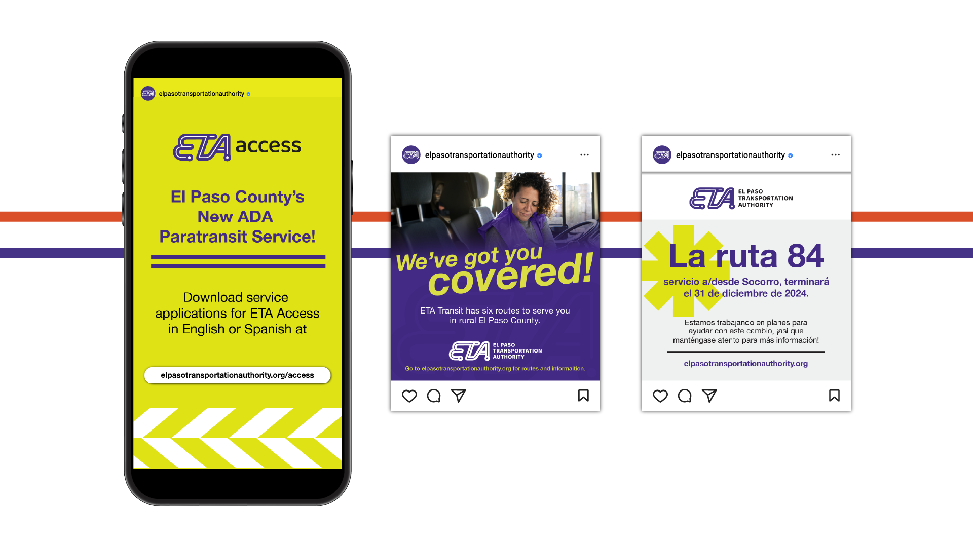
The goal was to create a flexible system that accommodates current and future transportation services, would encompass all of the participating government entities, and build awareness, trust and a unified presence. The new brand should be reliable, accessible, modern, vibrant, and community-focused, with a personable, relatable voice. The new identity must be easily recognizable across platforms, using vibrant colors and clean design for diverse settings. Ultimately, EPATS, LGC, aims to establish a strong brand that builds confidence among riders and reflects their commitment to providing accessible and innovative transportation solutions for the region.
Challenges
EPATS’ first operated its public transportation under the name El Paso County Public Transit (EPCT). EPATS faced challenges with their previous name and branding attempts, hindering awareness and recognition. As they began to roll out new services and look to the future, EPATS, LGC, sought a new brand name and identity system.

Brand Name
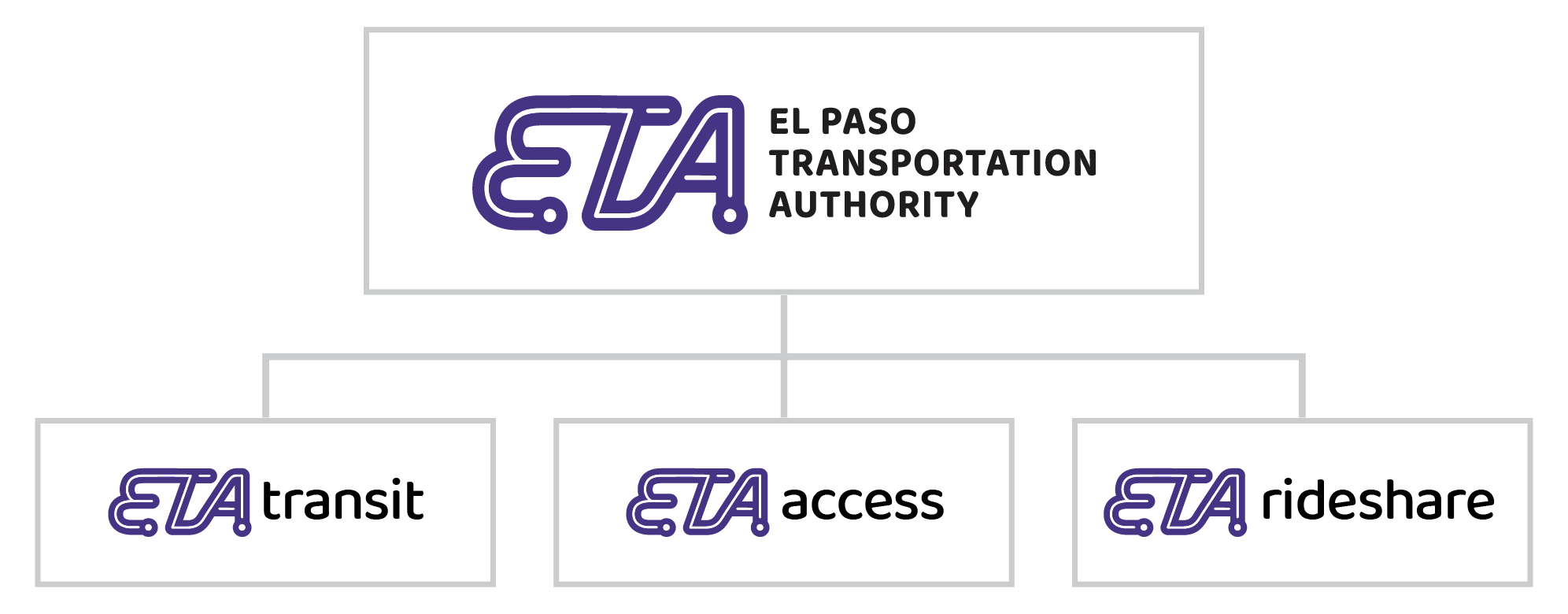
The result of the brand naming exercise was El Paso Transportation Authority, or ETA for short. While acronyms are what caused so much confusion in the first place, we spun it in a way that would make it relevant and memorable. ETA, typically meaning Estimated Time of Arrival, evokes travel and transportation. It also allowed for the opportunity to systematically incorporate their services, such as ETA Transit, ETA Paratransit, ETA Rideshare, and more, in a way that is easy to understand for the public.
Brand Architecture
Brand Identity
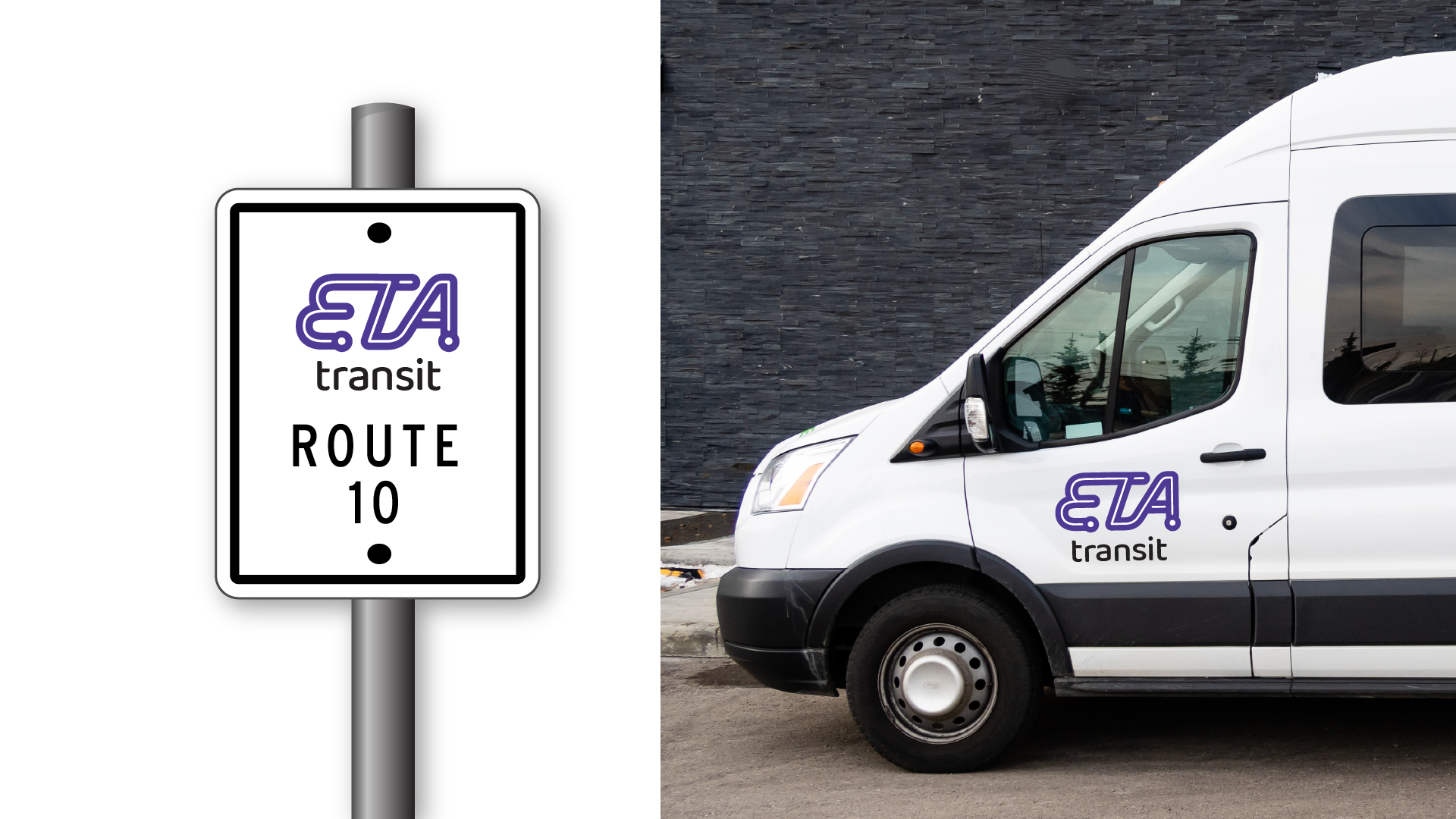
The Identity that followed was made up of the letters ETA --connecting lines with dots at the ends to imply going from point A to point B. The logo, paired with a clean, friendly and rounded type, spoke to the ETA as a professional institution, while remaining accessible and friendly.


Project Team
Gabriel Garcia - Creative Director
Joseph Bueno - Graphic Designer